Шаблон начальной загрузки на Bootstrap 4
 Этот шаблон содержит компоненты, которые являются новыми в Bootstrap 4.
Шаблон включает 5-уровневую сетку, теги, пользовательские формы, карточки и многое другое. Данный шаблон можно использовать для наглядного примера разметки в бутстрапе.
Шаблон имеет малый вес и будет расположен ниже в редакторе.
<!DOCTYPE html>
<!-- Template by Quackit.com -->
<html lang="en">
<head>
<meta charset="utf-8">
<meta http-equiv="X-UA-Compatible" content="IE=edge">
<meta name="viewport" content="width=device-width, initial-scale=1, shrink-to-fit=no">
<!-- The above 3 meta tags *must* come first in the head; any other head content must come *after* these tags -->
<meta name="description" content="">
<meta name="author" content="">
<link rel="icon" href="/favicon.ico">
<title>Bootstrap 4 Template</title>
<!-- Latest compiled and minified CSS -->
<link rel="stylesheet" href="https://maxcdn.bootstrapcdn.com/bootstrap/4.0.0-alpha.3/css/bootstrap.min.css" integrity="sha384-MIwDKRSSImVFAZCVLtU0LMDdON6KVCrZHyVQQj6e8wIEJkW4tvwqXrbMIya1vriY" crossorigin="anonymous">
<!-- Some extra styles (remove if not needed) -->
<style>
section {
padding: 70px 0;
border-bottom: 1px dotted #ccc;
}
/* So that we can see the grid */
.grid-example div[class^="col"] {
border: 1px solid white;
background: lightblue;
text-align: center;
padding-top: 8px;
padding-bottom: 8px;
}
/* Overide Jumbotron's color */
.jumbotron {
background-color: lightskyblue;
}
</style>
</head>
<body data-spy="scroll" data-target="#navbar-example">
<nav id="topNav" class="navbar navbar-full navbar-static-top navbar-dark bg-inverse">
<div class="container">
<button class="navbar-toggler hidden-md-up pull-right" type="button" data-toggle="collapse" data-target="#collapsingNavbar">
☰
</button>
<a class="navbar-brand" href="#">Logo</a>
<div class="collapse navbar-toggleable-sm" id="collapsingNavbar">
<ul class="nav navbar-nav">
<li class="nav-item">
<a class="nav-link" href="#grid">Grid</a>
</li>
<li class="nav-item">
<a class="nav-link" href="#cards">Cards</a>
</li>
<li class="nav-item">
<a class="nav-link" href="#tags">Tags</a>
</li>
<li class="nav-item">
<a class="nav-link" href="#customForms">Forms</a>
</li>
<li class="nav-item">
<a class="nav-link" href="#outlineButtons">Buttons</a>
</li>
<li class="nav-item">
<a class="nav-link" href="#progress">Progress Bars</a>
</li>
<li class="nav-item">
<a class="nav-link" href="#tables">Tables</a>
</li>
</ul>
</div>
</div>
</nav>
<div class="jumbotron jumbotron-fluid">
<div class="container">
<h1 class="display-3">Fluid Jumbotron!</h1>
<p>This is a fluid jumbotron. Fluid jumbotrons occupy the entire horizontal space of its parent.</p>
<p>Fluid jumbotrons are new in Bootstrap 4.</p>
<p><a class="btn btn-primary btn-lg" href="http://www.quackit.com/bootstrap/bootstrap_4/tutorial/bootstrap_jumbotron.cfm" role="button">Jumbotron Examples »</a></p>
</div>
</div>
<div class="container">
<section id="grid">
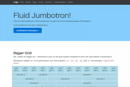
<h2>Bigger Grid</h2>
<p>OK, maybe not <em>bigger</em> but... Bootstrap 4 uses a 5 tier grid system compared to the 4 tier grid system in Bootstrap 3.</p>
<p>Bootstrap 4 added <code>sm</code> to its grid classes, so it now supports <code>xs</code>, <code>sm</code>, <code>md</code>, <code>lg</code>, and <code>xl</code> (for example, <code>class="col-sm-6</code>).</p>
<div class="grid-example">
<!-- Bootstrap Grid -->
<div class="row">
<div class="col-sm-1">.col-sm-1</div>
<div class="col-sm-1">.col-sm-1</div>
<div class="col-sm-1">.col-sm-1</div>
<div class="col-sm-1">.col-sm-1</div>
<div class="col-sm-1">.col-sm-1</div>
<div class="col-sm-1">.col-sm-1</div>
<div class="col-sm-1">.col-sm-1</div>
<div class="col-sm-1">.col-sm-1</div>
<div class="col-sm-1">.col-sm-1</div>
<div class="col-sm-1">.col-sm-1</div>
<div class="col-sm-1">.col-sm-1</div>
<div class="col-sm-1">.col-sm-1</div>
</div>
<div class="row">
<div class="col-sm-2">.col-sm-2</div>
<div class="col-sm-3">.col-sm-3</div>
<div class="col-sm-7">.col-sm-7</div>
</div>
<div class="row">
<div class="col-sm-4">.col-sm-4</div>
<div class="col-sm-4">.col-sm-4</div>
<div class="col-sm-4">.col-sm-4</div>
</div>
<div class="row">
<div class="col-sm-5">.col-sm-5</div>
<div class="col-sm-7">.col-sm-7</div>
</div>
<div class="row">
<div class="col-sm-6">.col-sm-6</div>
<div class="col-sm-6">.col-sm-6</div>
</div>
<div class="row">
<div class="col-sm-12">.col-sm-12</div>
</div>
</div>
<p>The following table shows how different grid options work with different viewport sizes.</p>
<table class="table table-bordered table-striped">
<thead>
<tr>
<th> </th>
<th>
Extra small
<small><34em</small>
</th>
<th>
Small
<small>≥34em</small>
</th>
<th>
Medium
<small>≥48em</small>
</th>
<th>
Large
<small>≥62em</small>
</th>
<th>
Extra large
<small>≥75em</small>
</th>
</tr>
</thead>
<tbody>
<tr>
<th class="text-nowrap" scope="row">Grid behavior</th>
<td>Horizontal at all times</td>
<td colspan="4">Collapsed to start, horizontal above breakpoints</td>
</tr>
<tr>
<th class="text-nowrap" scope="row">Container width</th>
<td>None (auto)</td>
<td>34rem</td>
<td>45rem</td>
<td>60rem</td>
<td>72.25rem</td>
</tr>
<tr>
<th class="text-nowrap" scope="row">Class prefix</th>
<td><code>.col-xs-</code></td>
<td><code>.col-sm-</code></td>
<td><code>.col-md-</code></td>
<td><code>.col-lg-</code></td>
<td><code>.col-xl-</code></td>
</tr>
<tr>
<th class="text-nowrap" scope="row">Number of columns</th>
<td colspan="5">12</td>
</tr>
<tr>
<th class="text-nowrap" scope="row">Gutter width</th>
<td colspan="5">30px (15px on each side of a column)</td>
</tr>
<tr>
<th class="text-nowrap" scope="row">Nestable</th>
<td colspan="5">Yes</td>
</tr>
<tr>
<th class="text-nowrap" scope="row">Offsets</th>
<td colspan="5">Yes</td>
</tr>
<tr>
<th class="text-nowrap" scope="row">Column ordering</th>
<td colspan="5">Yes</td>
</tr>
</tbody>
</table>
</section>
<section id="cards">
<h2>Introducing Cards</h2>
<p>In Bootstrap 4, <a href="http://www.quackit.com/bootstrap/bootstrap_4/tutorial/bootstrap_cards.cfm">cards</a> replace panels, thumbnails and wells from Bootstrap 3.</p>
<div class="card-columns">
<!-- Card 1 -->
<div class="card">
<div class="card-header">Card 1</div>
<div class="card-block">
<p class="card-text">Text for this card.</p>
</div>
</div>
<!-- Card 2 -->
<div class="card">
<div class="card-block">
<h4 class="card-title">Card 2</h4>
<p class="card-text">Text for this card.</p>
</div>
</div>
<!-- Card 3 -->
<div class="card">
<div class="card-header">Card 3</div>
<div class="card-block">
<p class="card-text">Text for this card. Here's <a href="#" class="card-link">why</a>.</p>
</div>
<div class="card-footer">Footer</div>
</div>
<!-- Card 4 -->
<div class="card">
<div class="card-header">Card 4</div>
<div class="card-block">
<p class="card-text">Text for this card.</p>
</div>
<div class="card-footer">Footer</div>
</div>
<!-- Card 5 -->
<div class="card">
<div class="card-block">
<h4 class="card-title">Card 5</h4>
<p class="card-text">Text for this card.</p>
</div>
</div>
<!-- Card 6 -->
<div class="card">
<div class="card-header">Card 6</div>
<div class="card-block">
<p class="card-text">Text for this card. Here's <a href="#" class="card-link">why</a>.</p>
</div>
</div>
<!-- Card 7 -->
<div class="card">
<div class="card-header">Card 7</div>
<div class="card-block">
<p class="card-text">Text for this card. Here's <a href="#" class="card-link">why</a>.</p>
</div>
<div class="card-footer">Footer</div>
</div>
<!-- Card 8 -->
<div class="card">
<div class="card-block">
<h4 class="card-title">Card 8</h4>
<p class="card-text">Text for this card.</p>
</div>
</div>
</div>
</section>
<section id="tags">
<h2>Introducing <span class="tag tag-default">Tags</span></h2>
<p>Bootstrap's tag classes can be used to highlight additional information that's appended to a string of text. </p>
<p><a href="http://www.quackit.com/bootstrap/bootstrap_4/tutorial/bootstrap_tags.cfm">Tags</a> replace labels from Bootstrap 3.</p>
<h3>Contextual Tags</h3>
<p>Add some color based on context.</p>
<p>
<span class="tag tag-default">Default</span>
<span class="tag tag-primary">Primary</span>
<span class="tag tag-success">Success</span>
<span class="tag tag-info">Info</span>
<span class="tag tag-warning">Warning</span>
<span class="tag tag-danger">Danger</span>
</p>
<h3>Pill Tags</h3>
<p>Use the <code>.tag-pill</code> class to give your tags rounded corners.</p>
<p>
<span class="tag tag-pill tag-default">Default</span>
<span class="tag tag-pill tag-primary">Primary</span>
<span class="tag tag-pill tag-success">Success</span>
<span class="tag tag-pill tag-info">Info</span>
<span class="tag tag-pill tag-warning">Warning</span>
<span class="tag tag-pill tag-danger">Danger</span>
</p>
</section>
<section id="customForms">
<h2>Introducing Custom Forms</h2>
<p>Bootstrap 4 introduces <a href="http://www.quackit.com/bootstrap/bootstrap_4/tutorial/bootstrap_custom_forms.cfm">custom forms</a>. These are custom form elements that completely replace the browser defaults. The idea behind custom forms is that they allow for more customization and cross browser consistency.</p>
<p>
<label class="custom-control custom-checkbox">
<input type="checkbox" class="custom-control-input">
<span class="custom-control-indicator"></span>
<span class="custom-control-description">Boots</span>
</label>
<label class="custom-control custom-checkbox">
<input type="checkbox" class="custom-control-input">
<span class="custom-control-indicator"></span>
<span class="custom-control-description">Shoes</span>
</label>
</p>
<div class="custom-controls-stacked">
<label class="custom-control custom-radio">
<input id="radioStacked1" name="radio-stacked" type="radio" class="custom-control-input">
<span class="custom-control-indicator"></span>
<span class="custom-control-description">Boots</span>
</label>
<label class="custom-control custom-radio">
<input id="radioStacked2" name="radio-stacked" type="radio" class="custom-control-input">
<span class="custom-control-indicator"></span>
<span class="custom-control-description">Shoes</span>
</label>
</div>
<p>
<select class="custom-select">
<option selected>Choose One...</option>
<option value="1">Boots</option>
<option value="2">Shoes</option>
<option value="3">Feet</option>
</select>
</p>
<p>
<label class="custom-file">
<input type="file" id="file" class="custom-file-input">
<span class="custom-file-control"></span>
</label>
</p>
</section>
<section id="outlineButtons">
<h2>Outline Buttons</h2>
<p>Bootstrap 4 introduces outline buttons — buttons with a contextual outline.</p>
<button type="button" class="btn btn-lg btn-outline-primary">Primary</button>
<button type="button" class="btn btn-lg btn-outline-secondary">Secondary</button>
<button type="button" class="btn btn-lg btn-outline-info">Info</button>
<button type="button" class="btn btn-lg btn-outline-success">Success</button>
<button type="button" class="btn btn-lg btn-outline-warning">Warning</button>
<button type="button" class="btn btn-lg btn-outline-danger">Danger</button>
</section>
<section id="progress">
<h2>Progress Bars</h2>
<p>Bootstrap 4 takes advantage of the HTML5 <a href="http://www.quackit.com/html/tags/html_progress_tag.cfm"><code><progress></code></a> element when working with progress bars.</p>
<progress class="progress progress-success" value="73" max="100">73%</progress>
<progress class="progress progress-info" value="500" max="1000">50%</progress>
<progress class="progress progress-warning" value="35" max="100">35%</progress>
<progress class="progress progress-danger" value="200" max="1000">20%</progress>
</section>
<section id="tables">
<h2>Responsive Tables</h2>
<p>Bootstrap 4 allows you to apply the <code>.table-responsive</code> class directly to the table (as opposed to being required to apply it to a parent element, like in Bootstrap 3).</p>
<table class="table table-responsive">
<thead>
<tr>
<th>Header 1</th>
<th>Header 2</th>
<th>Header 3</th>
<th>Header 4</th>
<th>Header 5</th>
<th>Header 6</th>
<th>Header 7</th>
<th>Header 8</th>
<th>Header 9</th>
<th>Header 10</th>
</tr>
</thead>
<tbody>
<tr>
<td>Cell</td>
<td>Cell</td>
<td>Cell</td>
<td>Cell</td>
<td>Cell</td>
<td>Cell</td>
<td>Cell</td>
<td>Cell</td>
<td>Cell</td>
<td>Cell</td>
</tr>
<tr>
<td>Cell</td>
<td>Cell</td>
<td>Cell</td>
<td>Cell</td>
<td>Cell</td>
<td>Cell</td>
<td>Cell</td>
<td>Cell</td>
<td>Cell</td>
<td>Cell</td>
</tr>
<tr>
<td>Cell</td>
<td>Cell</td>
<td>Cell</td>
<td>Cell</td>
<td>Cell</td>
<td>Cell</td>
<td>Cell</td>
<td>Cell</td>
<td>Cell</td>
<td>Cell</td>
</tr>
</tbody>
</table>
</section>
<section>
<h3>Reflow Tables</h3>
<p>There's a new <code>.table-reflow</code> class that effectively turns your table on its side.</p>
<table class="table table-reflow">
<thead>
<tr>
<th>Header 1</th>
<th>Header 2</th>
<th>Header 3</th>
<th>Header 4</th>
<th>Header 5</th>
<th>Header 6</th>
<th>Header 7</th>
<th>Header 8</th>
<th>Header 9</th>
<th>Header 10</th>
</tr>
</thead>
<tbody>
<tr>
<td>Cell</td>
<td>Cell</td>
<td>Cell</td>
<td>Cell</td>
<td>Cell</td>
<td>Cell</td>
<td>Cell</td>
<td>Cell</td>
<td>Cell</td>
<td>Cell</td>
</tr>
<tr>
<td>Cell</td>
<td>Cell</td>
<td>Cell</td>
<td>Cell</td>
<td>Cell</td>
<td>Cell</td>
<td>Cell</td>
<td>Cell</td>
<td>Cell</td>
<td>Cell</td>
</tr>
<tr>
<td>Cell</td>
<td>Cell</td>
<td>Cell</td>
<td>Cell</td>
<td>Cell</td>
<td>Cell</td>
<td>Cell</td>
<td>Cell</td>
<td>Cell</td>
<td>Cell</td>
</tr>
</tbody>
</table>
</section>
<section>
<h3>Table Head Styles</h3>
<p>You can add background color to your table headers in Bootstrap 4.</p>
<table class="table">
<thead class="thead-inverse">
<tr>
<th>Header 1</th>
<th>Header 2</th>
<th>Header 3</th>
</tr>
</thead>
<tfoot>
<tr>
<th>Footer 1</th>
<th>Footer 2</th>
<th>Footer 3</th>
</tr>
</tfoot>
<tbody>
<tr>
<td>Cell</td>
<td>Cell</td>
<td>Cell</td>
</tr>
<tr>
<td>Cell</td>
<td>Cell</td>
<td>Cell</td>
</tr>
<tr>
<td>Cell</td>
<td>Cell</td>
<td>Cell</td>
</tr>
</tbody>
</table>
</section>
<footer>
<p>© Somebody 2016</p>
</footer>
</div> <!-- /container -->
<!-- Bootstrap core jаvascript
================================================== -->
<!-- Placed at the end of the document so the pages load faster -->
<!-- jQuery library -->
<script src="https://ajax.googleapis.com/ajax/libs/jquery/3.0.0/jquery.min.js" integrity="sha384-THPy051/pYDQGanwU6poAc/hOdQxjnOEXzbT+OuUAFqNqFjL+4IGLBgCJC3ZOShY" crossorigin="anonymous"></script>
<!-- Tether -->
<script src="https://cdnjs.cloudflare.com/ajax/libs/tether/1.2.0/js/tether.min.js" integrity="sha384-Plbmg8JY28KFelvJVai01l8WyZzrYWG825m+cZ0eDDS1f7d/js6ikvy1+X+guPIB" crossorigin="anonymous"></script>
<!-- Latest compiled jаvascript -->
<script src="https://maxcdn.bootstrapcdn.com/bootstrap/4.0.0-alpha.3/js/bootstrap.min.js" integrity="sha384-ux8v3A6CPtOTqOzMKiuo3d/DomGaaClxFYdCu2HPMBEkf6x2xiDyJ7gkXU0MWwaD" crossorigin="anonymous"></script>
<!-- Initialize Bootstrap functionality -->
<script>
// Initialize tooltip component
$(function () {
$('[data-toggle="tooltip"]').tooltip()
})
// Initialize popover component
$(function () {
$('[data-toggle="popover"]').popover()
})
</script>
</body>
</html>
Ссылка для скачивания доступна только авторизованным пользователям, пожалуйста пройдите регистрацию.
Это займёт не более минуты. Не волнуйтесь, мы не спамим!
У данной публикации нет комментариев.
Bootstrap сниппеты

Учебник Bootstrap

Учебник Bootstrap

Учебник Bootstrap

Учебник Bootstrap

Учебник Bootstrap

Информация
Посетители, находящиеся в группе Гости, не могут оставлять комментарии к данной публикации.
Облако тегов
Bootstrap bootstrap css CSS CSS3 DLE dle fruit farm html html шаблон html5 HTML5 Payeer PNG PSD wap Wordpress Скрипт удвоителя адаптивный адаптивный шаблон бонусник дизайн игровой хостинг иконки лендинг модуль панель портфолио сайт скрипт скрипт фермы текстура удвоитель удвоитель Payeer ферма фон фруктовая ферма хак шаблон экономическая игра
Как задать ширину в 100 пикселей в HTML